Lot 18
Robert Indiana (1928-)

Lot 18 Details
Robert Indiana (1928-), American
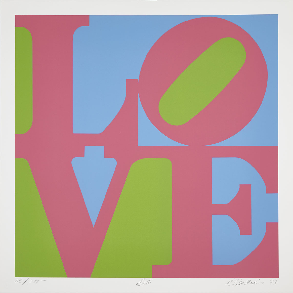
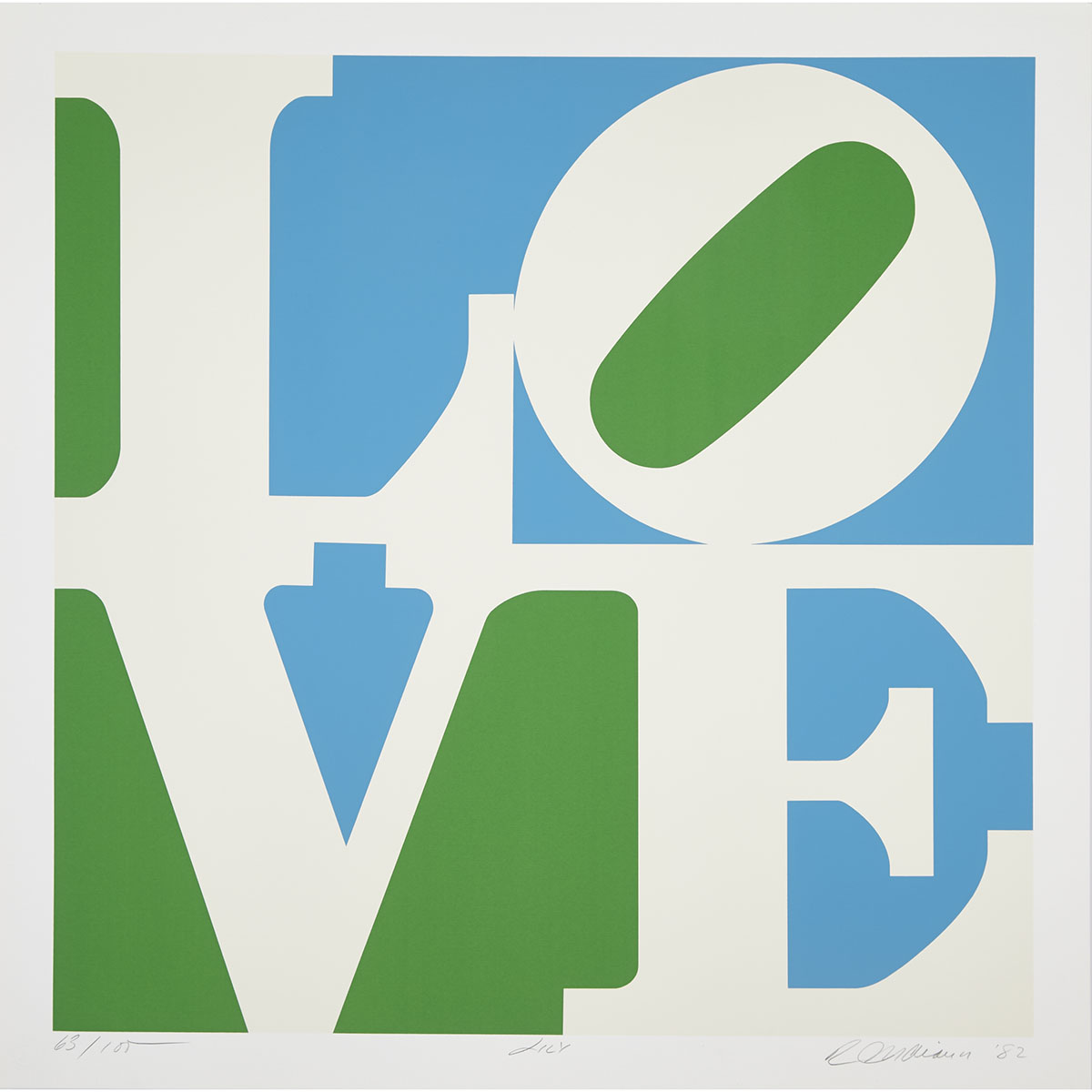
A GARDEN OF LOVE: ZINNIA; LILAC; PHLOX; ROSES; LILY; TULIP (SUITE OF SIX), 1982 [SHEEHAN, 126-131]
The complete set of six colour silkscreens on Fabriano watermarked paper; each signed, titled, dated ‘82, and numbered 63/100 in pencil to margin. Printed by Domberger, Filderstadt, with his blindstamp. Published by Prestige Art, Mamaroneck, New York, NY.
Each Image/Sheet 24" x 24" — 61 x 61 cm.; 26.75" x 26.75" — 67.9 x 67.9 cm.
Estimate $15,000-$25,000
Additional Images

Provenance:
Prominent Private Collection
Literature:
Mark Francis and Hal Foster, Pop, 2010, p. 156;
Ken Johnston, It Wasn’t All He Needed, or All He Did: Robert Indiana and “Beyond Love, at the Whitney - New York Times (September 23, 2013)
Note:
Nothing has become more emblematic than Robert Indiana’s LOVE with its block colour and bold type – such powerful imagery has become symbolic for so many movements: from political to counterculture to civil rights. No artwork can boast such influence as does Indiana’s A Garden of Love. The gravitas of this four letter word has become enormous. Canada’s own General Idea’s with their interpretation of LOVE using the letters AIDS during the height of the HIV/AIDS crisis to more recently, Obama’s presidential run, Indiana’s LOVE becoming HOPE.
A student devoted to the delicate yet refined process of printmaking, Indiana experimented with many techniques at the School of the Art Institute of Chicago before settling on silkscreen as the best medium to articulate his striking colours and clear lines.
According to the art historian, Susan Elizabeth Ryan, the composition of LOVE originated from humble beginnings; handmade Christmas cards made by the artist in the mid-60s. Using a stencil, Indiana filled a letter in each corner, with the specific intent of each letter touching in some capacity, slightly tilting the “O”. The following year in 1965, Indiana responded to a call from MoMA for an artist-designed Christmas card. Winning the coveted prize, the Museum chose the red, green and blue version for its optical effect and minimalistic aesthetic, coinciding with both movements taking off in America with two groundbreaking exhibitions in New York: MoMA’s own “The Responsive Eye” and “Primary Structures: Young Americans and British Sculptors” at the Jewish Museum.


